Evolving the visual language of an international B2B tech company

Client
Axway
Role
Brand design, Brand strategy, Art direction
Collaborators
Michael Major, Noel May, Paul French, Nicky Davis
Axway is an international B2B tech company with international headquarters in Paris, and American headquarters in Phoenix.
Specializing in back-end technology, Axway’s main products center around API, B2B, and MFT solutions. They have around 1,800 employees located globally, and have built a reputation of security and reliability amongst their customer base over the course of 20+ years.
When I was first brought into the team in 2020
as their Brand Designer I quickly realized that their visual identity was falling short for a number of reasons:
- The international appeal and unity was lacking. At the time, Axway struggled to unify under one visual identity. The design system being used wasn’t speaking internationally, and wasn’t being adhered to as the official language of Axway’s visual identity.
- Not only was systemic adoption of the brand language not happening, the flexibility for it to operate cross-culturally and in myriad channels was simply not there. The visual identity was, at the time, too restrictive for it to be applicable in many contexts.
- Lastly, the visual identity felt outdated, for fear of not living up to the reputation that the company built for itself over two decades. One word, security, lives as Axway’s brand promise to its B2B customers. They need to trust that Axway’s solutions can operate in many uses around the world, and not compromise Axway’s customers’ customers’ data. The visual identity was undoubtedly communicating safety, but from the stance of yesteryear, lacking in the more forward-looking perspectives that come out of Axway’s walls.
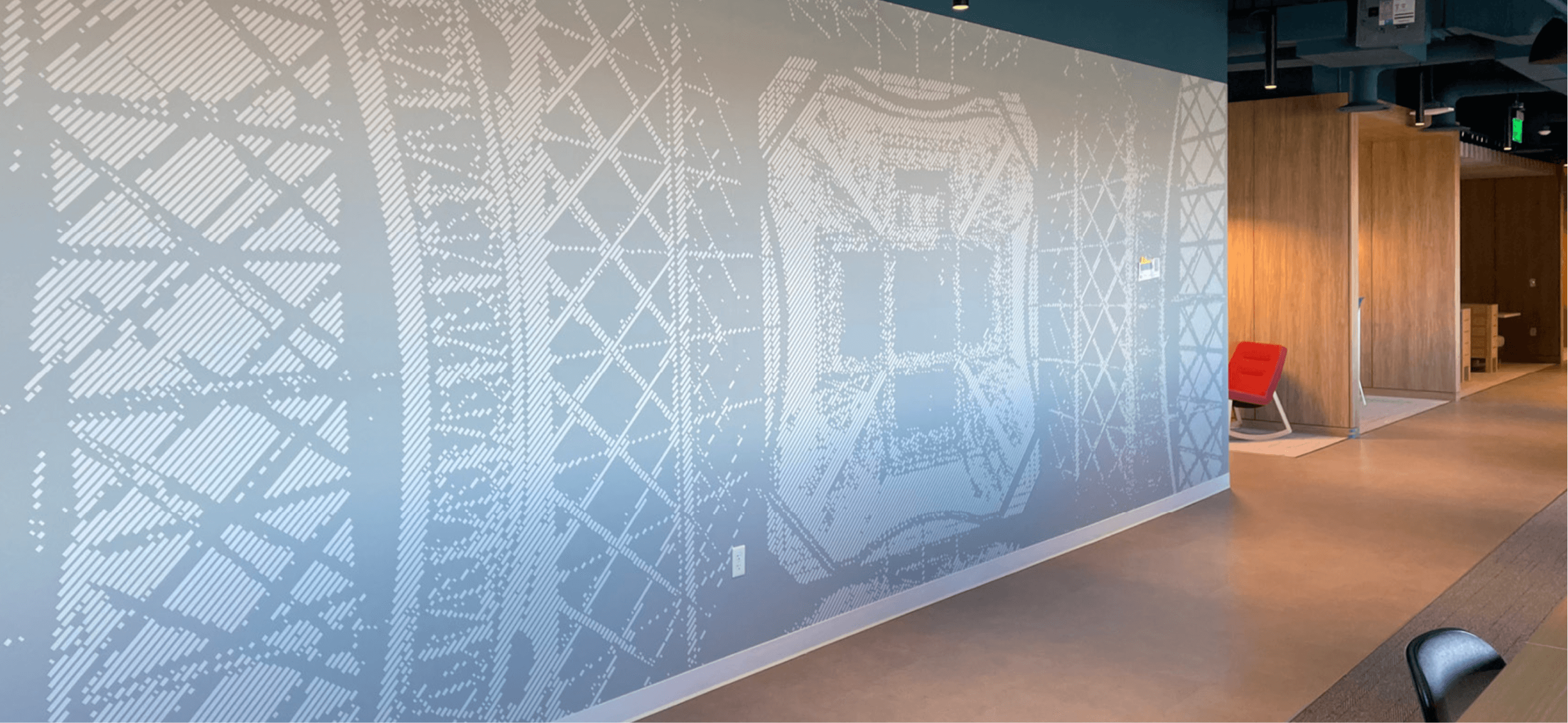
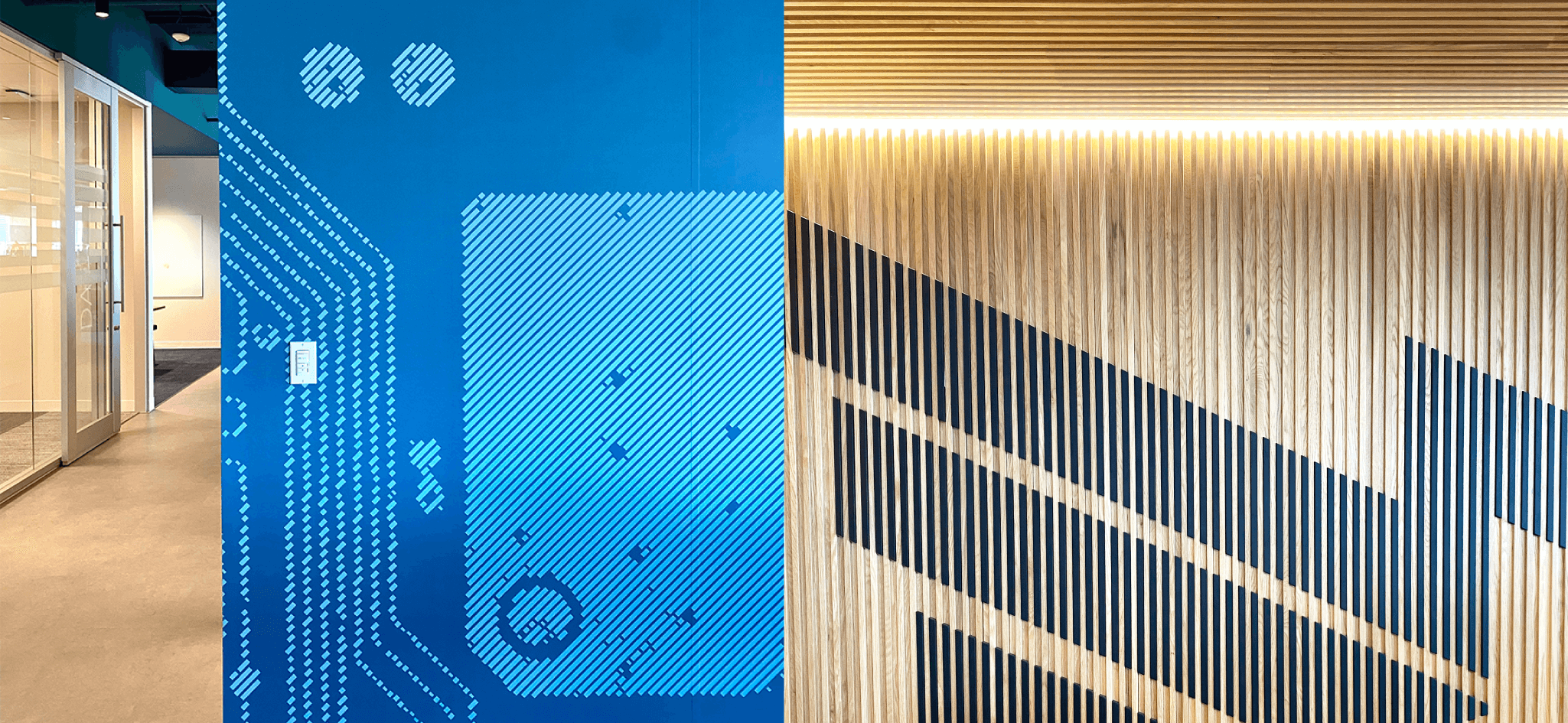
The first step in working towards a more robust identity was to create the brand narrative. Luckily, Axway had done some work in this area to make sense of the archetypal character that the company embodies. Internal stakeholders made it clear that Axway represents an adventurous and helpful explorer. They’re charting new waters, and leaving behind guides so that those who follow can navigate unfamiliar terrain with ease.
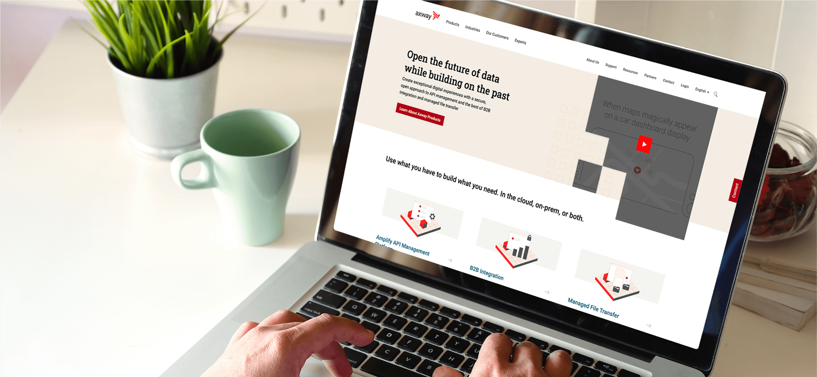
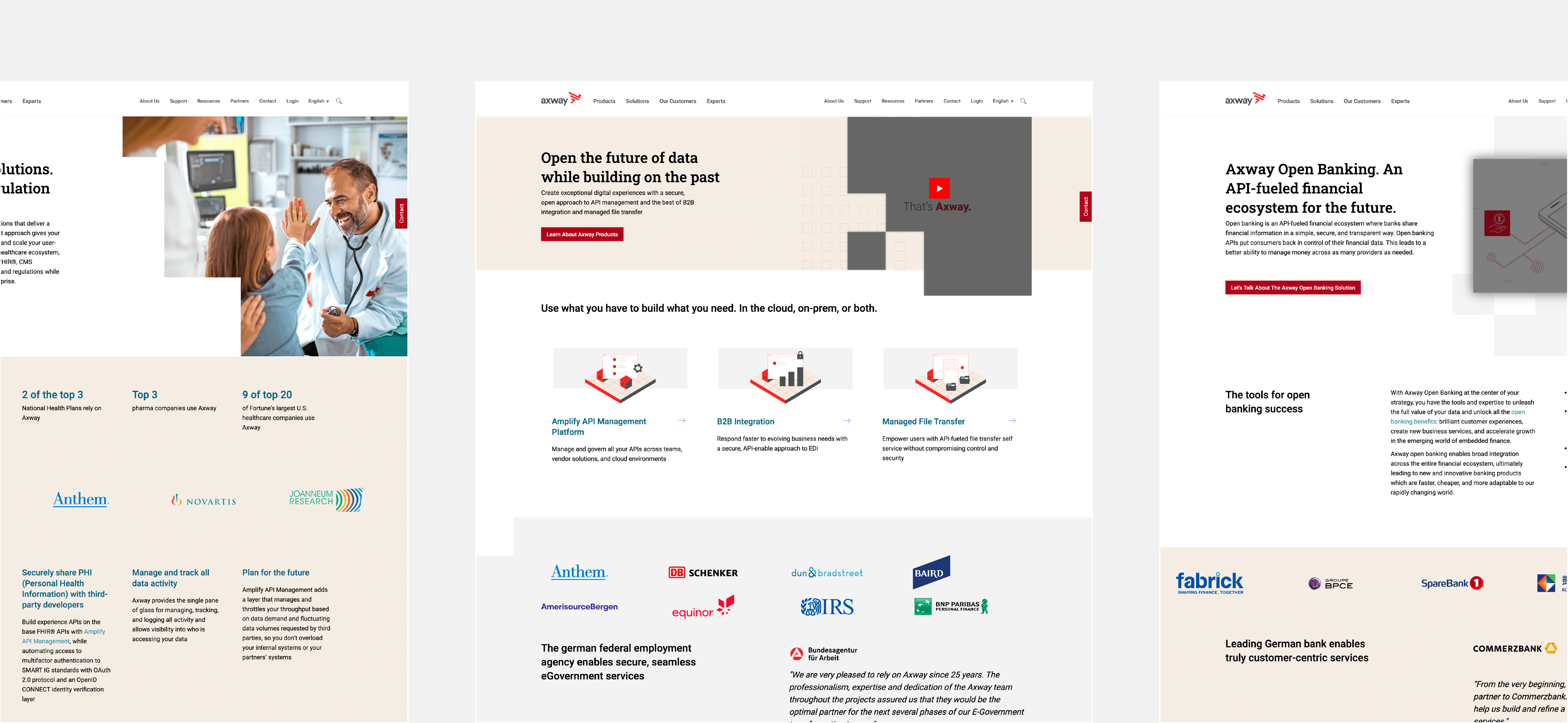
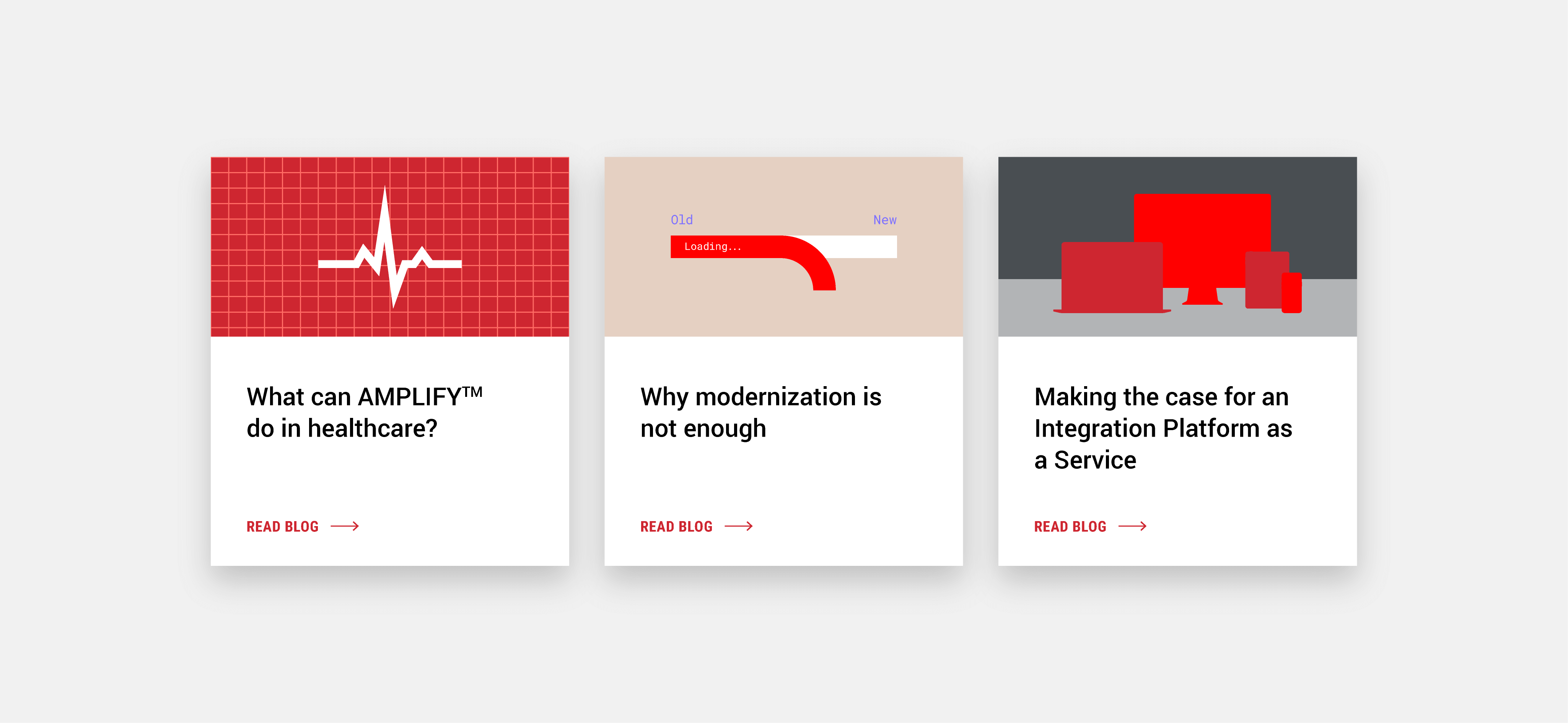
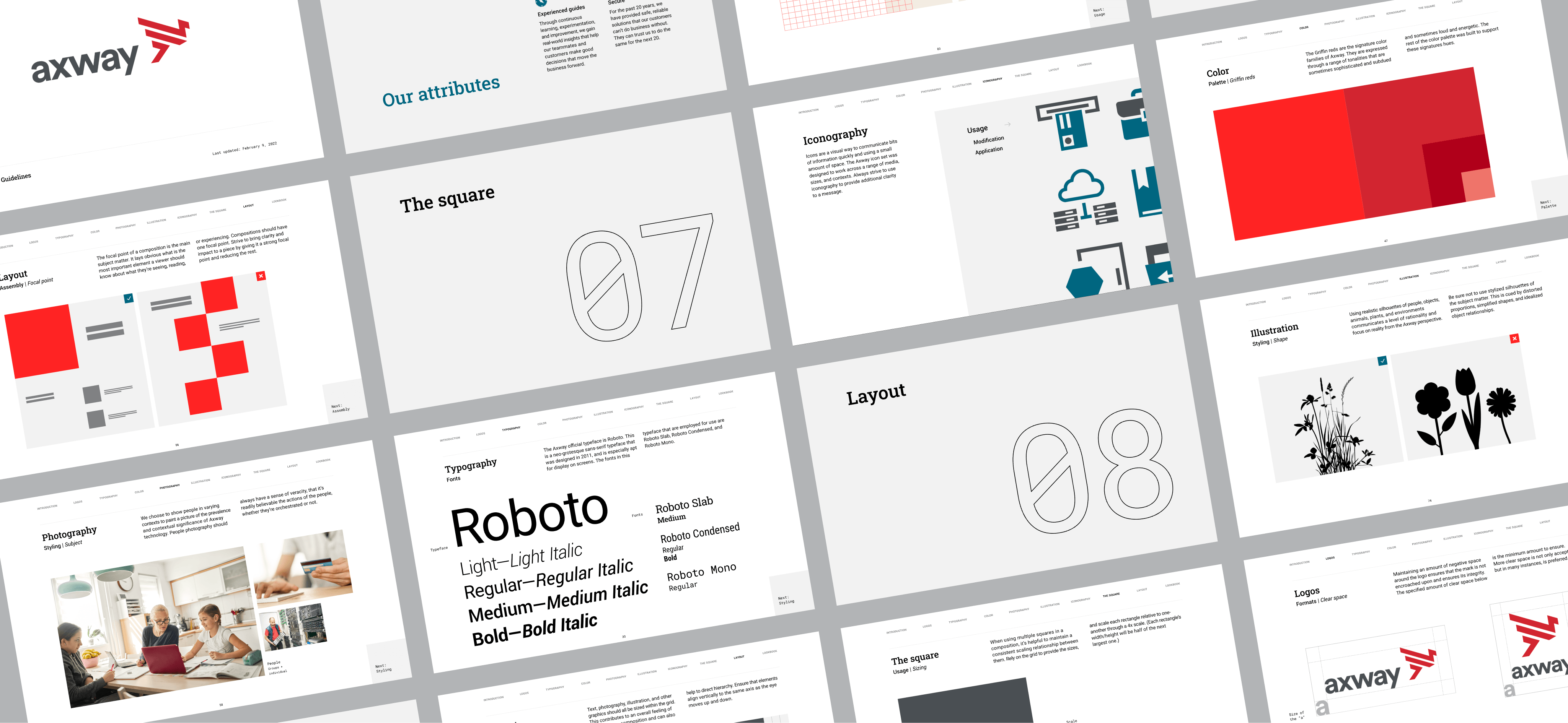
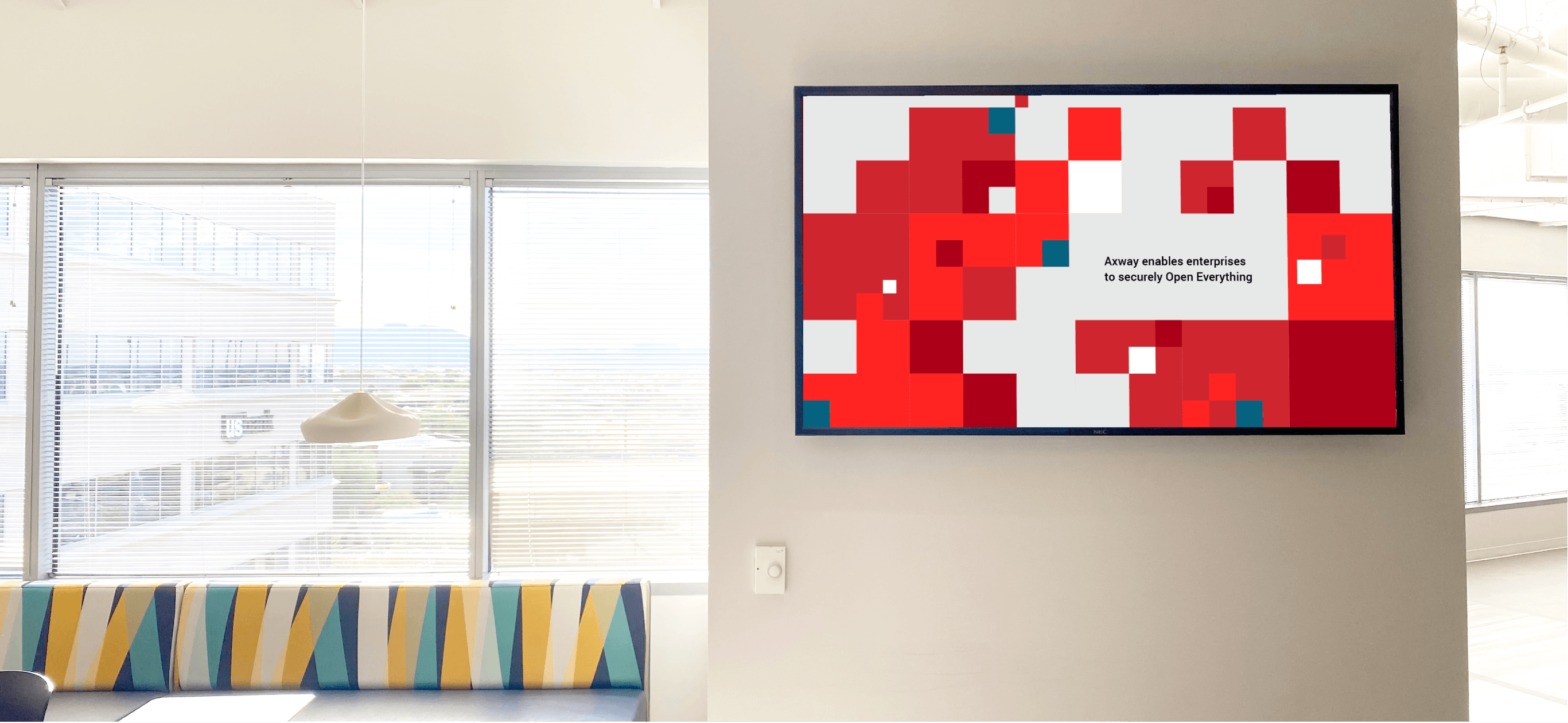
Axway’s visual identity was constructed around the use of a strong grid, alluding to cartographic processes of scaling and mapmaking.
Retaining the Griffin Red, the color palette was refined to include analogous hues, differentiating itself amongst competitors. The Roboto typeface was already in use by Axway, but was expanded out to include its plentiful and varying fonts. This, again, gave the visual identity more flexibility the ways that it expresses itself.
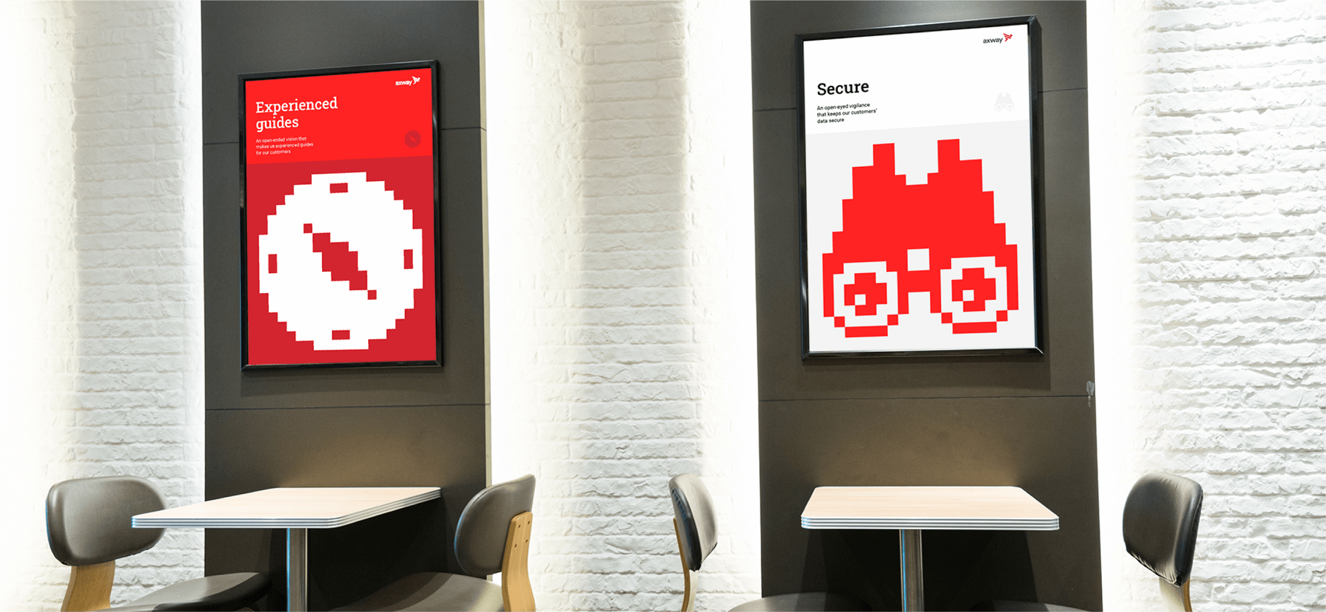
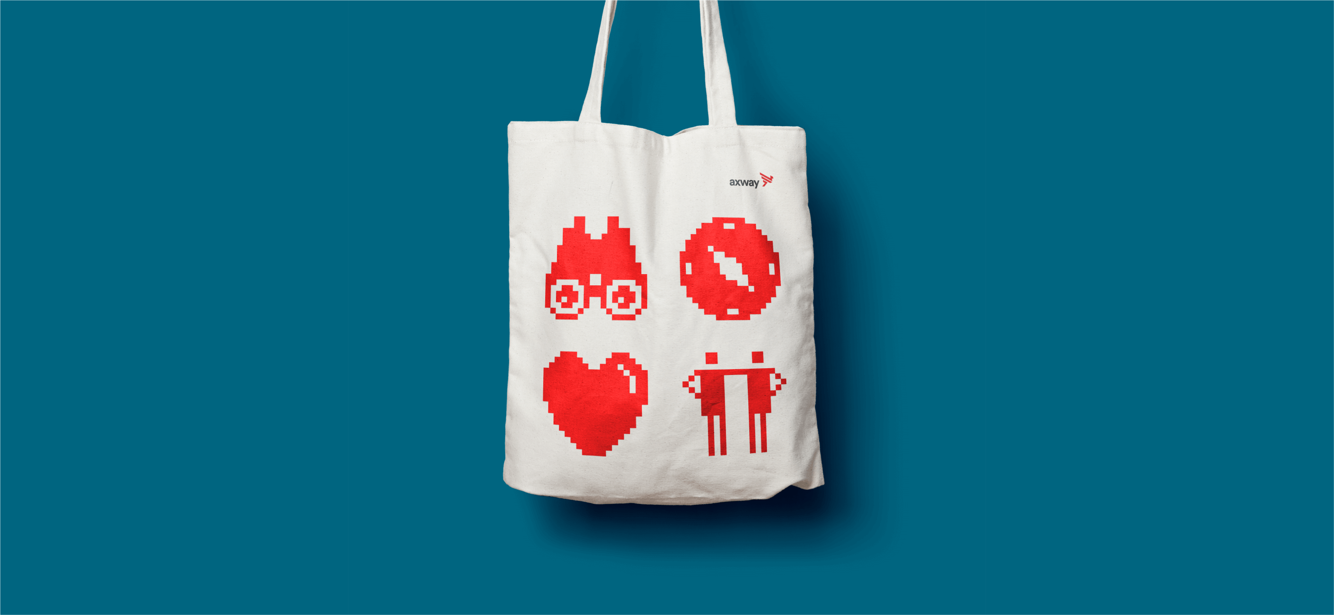
Robust, online visual identity guidelines were created to allow easy access to the brand roadmap.
This empowered offices around the world to seek clarity in unifying Axway’s communications. It also allowed clearer instruction in partnering with the many agencies that Axway relies on to create brand materials.
Through a concerted effort in laying bare the concerns of brand perception globally, Axway set itself up for an honest look into how we might construct a visual identity that speaks in all the tones necessary. Axway continues to pride itself on the trust and reliability that it has built with its customers. This visual identity allows them to continue to do so, and sets them up for success in communicating an identity based in security and timelessness.
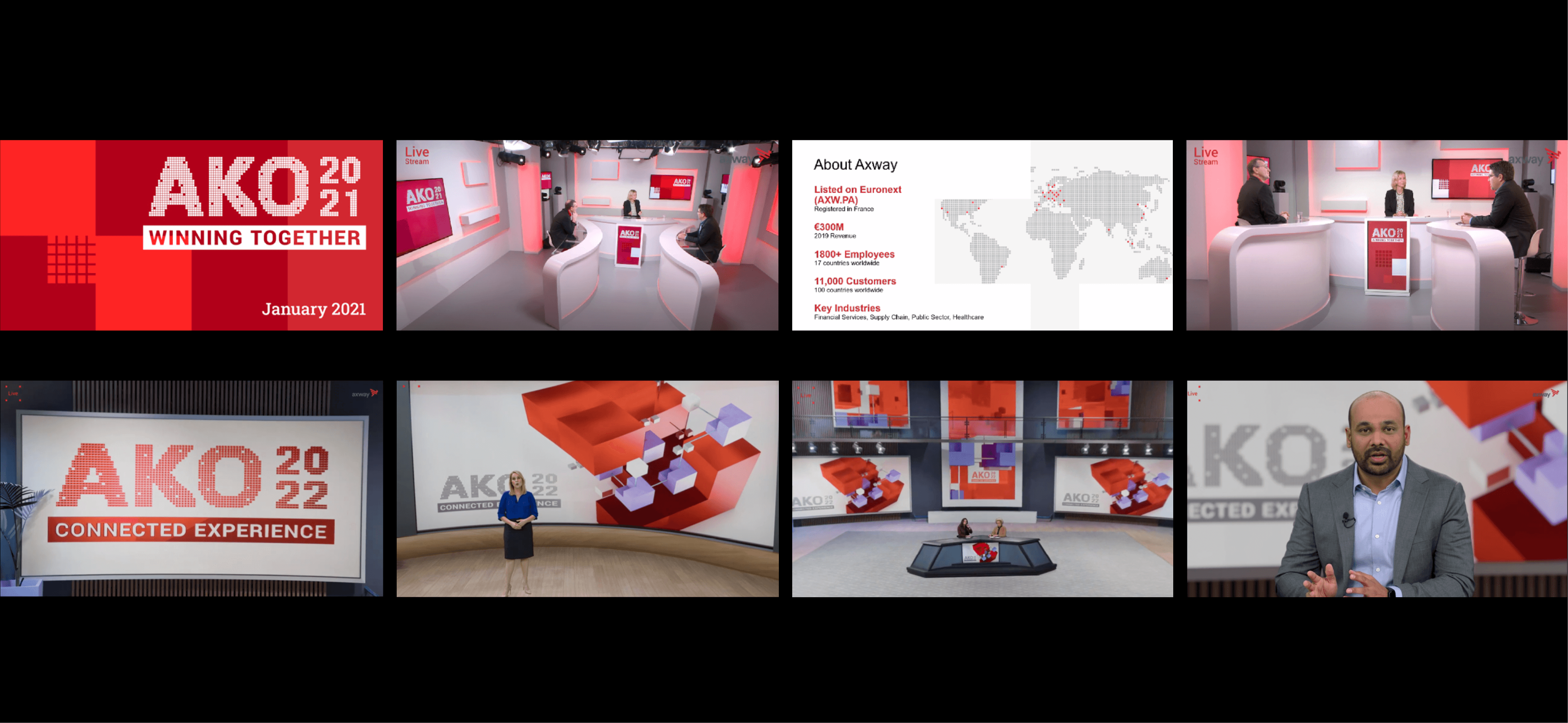


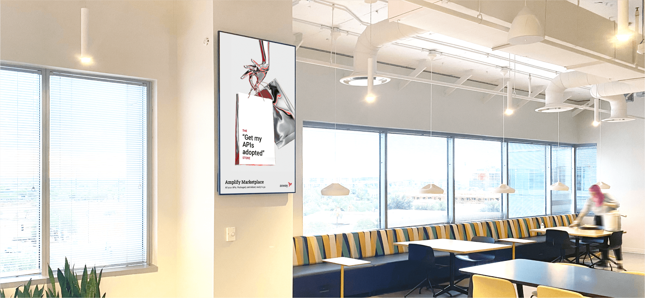
Axway continues to evolve its identity through use of campaigns.
The art direction and copy used for various product launches, announcements, and brand awareness campaigns affords them opportunities to experiment with new directions. These incremental movements on various routes towards the next step in its identity are crucial for brand maturation.
