Redesigning Axway’s corporate blog to improve SEO and usability
Redesigning Axway’s corporate blog to improve SEO and usability
Client
Axway
Role
UX design, UX research
Collaborators
James Maber, Shannon Mahorney, Shawn Borton, Nicky Davis
Collaborating with the SEO agency, Eyeful, Axway sought to improve the SEO performance of its corporate blog in 2022.
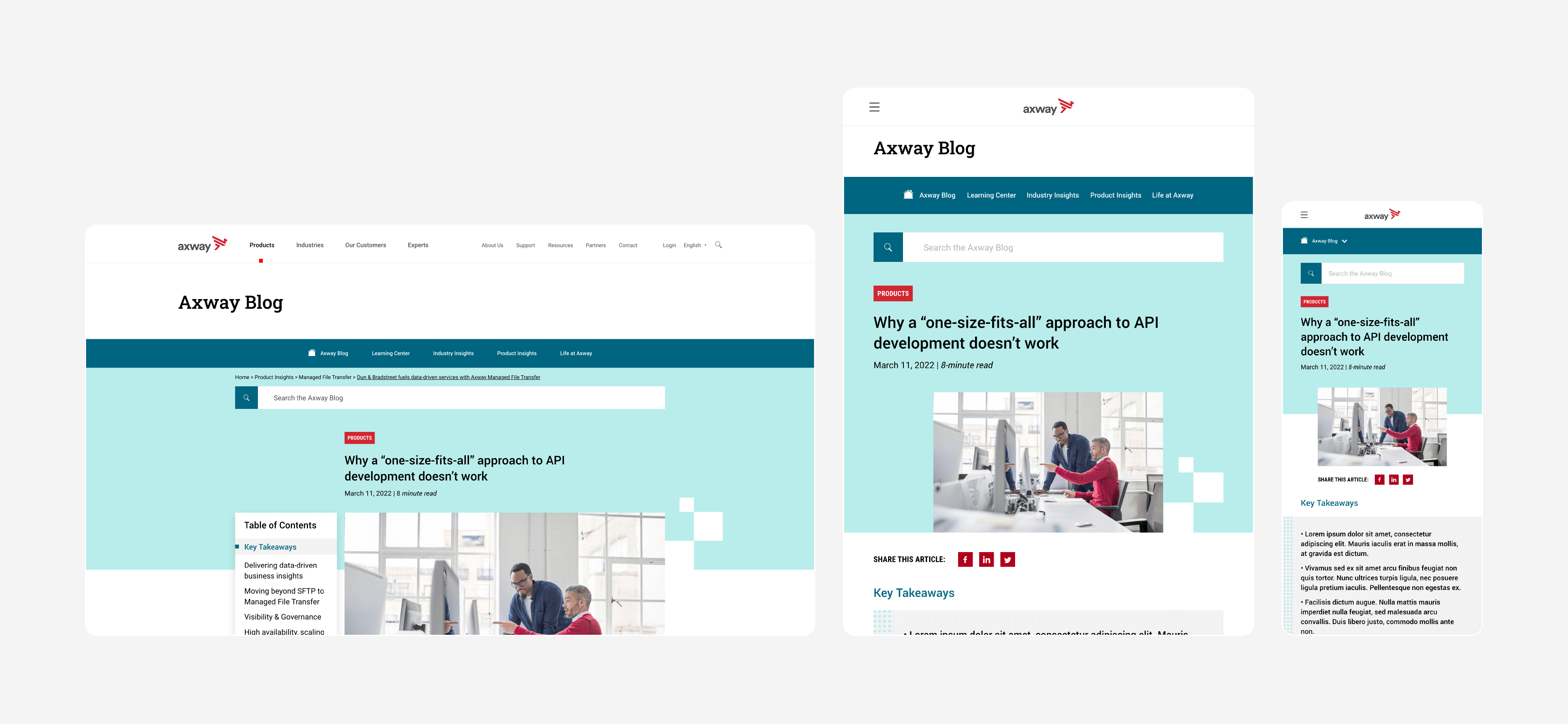
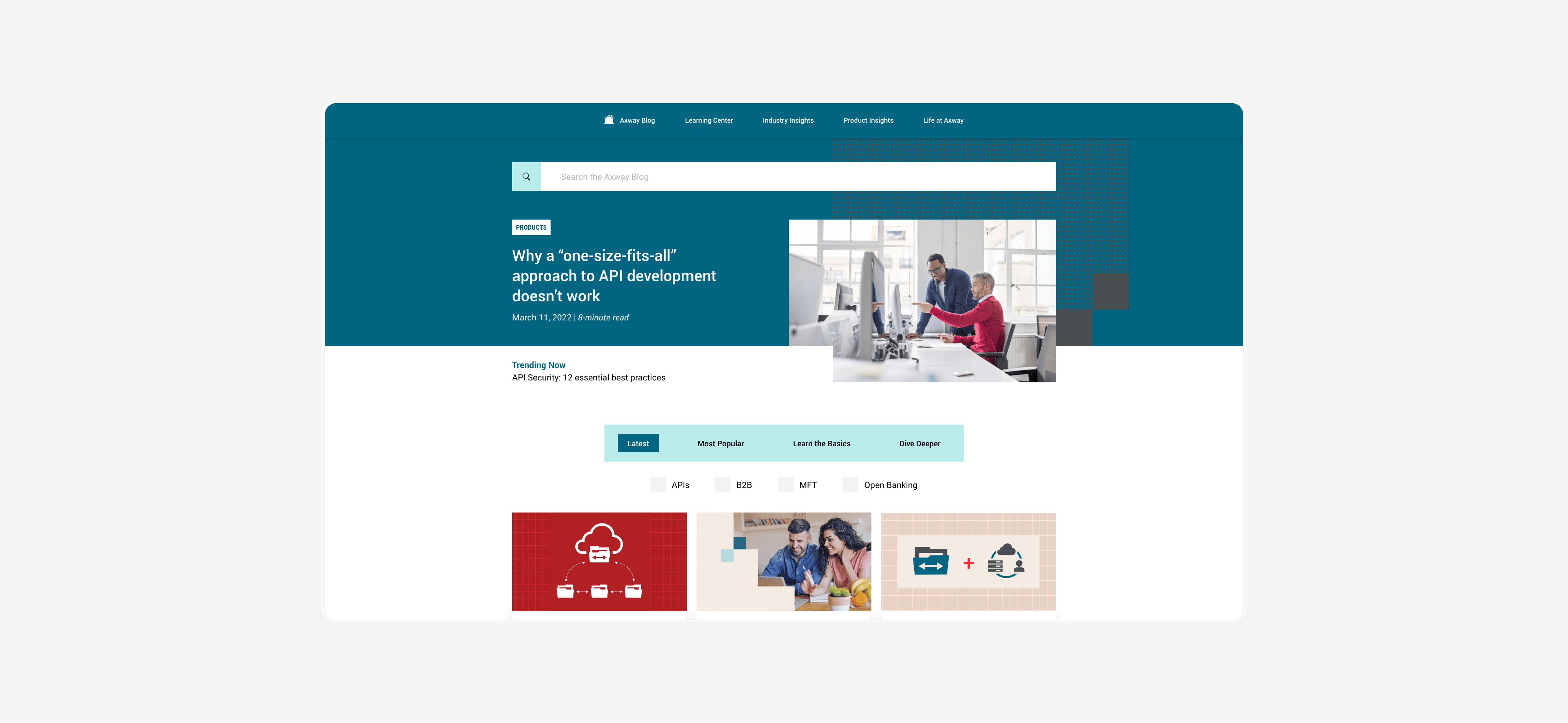
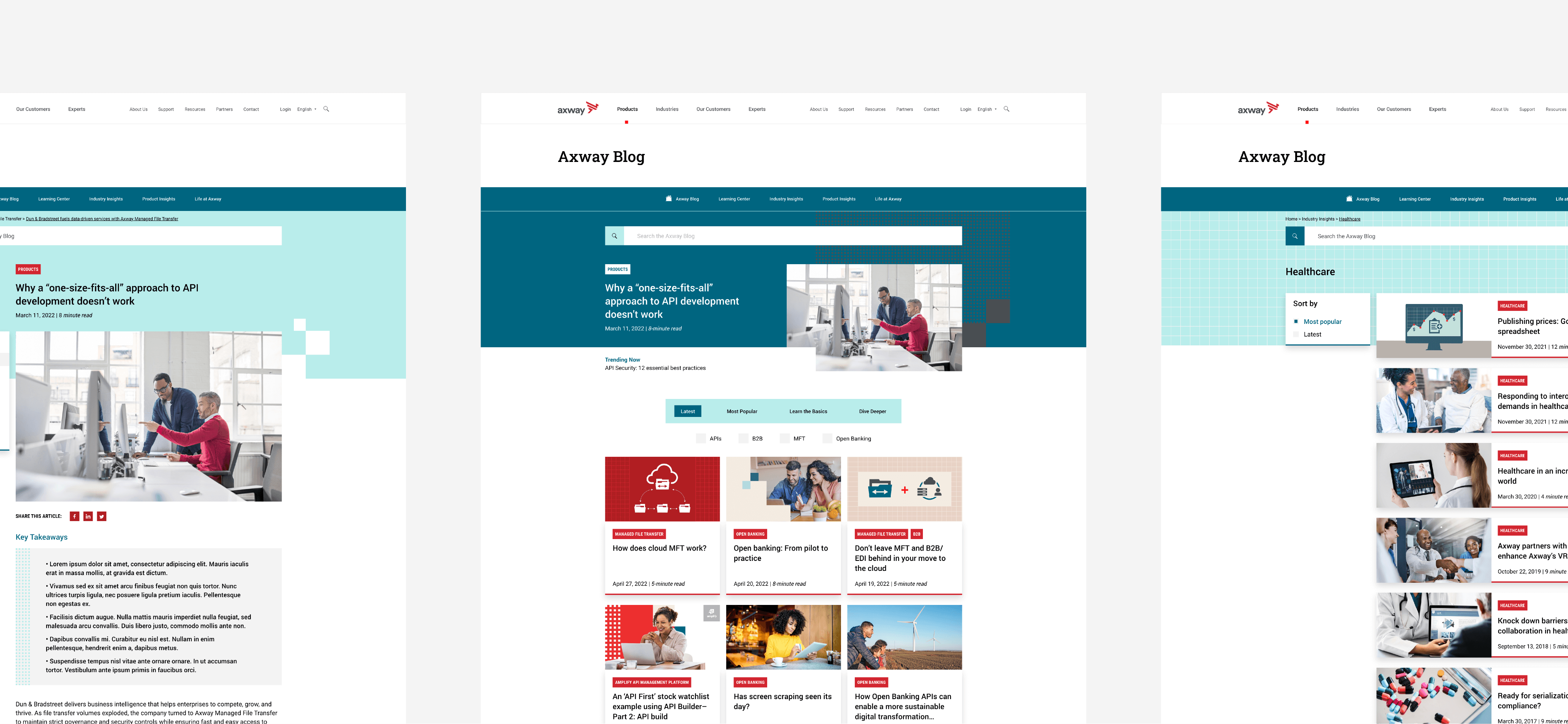
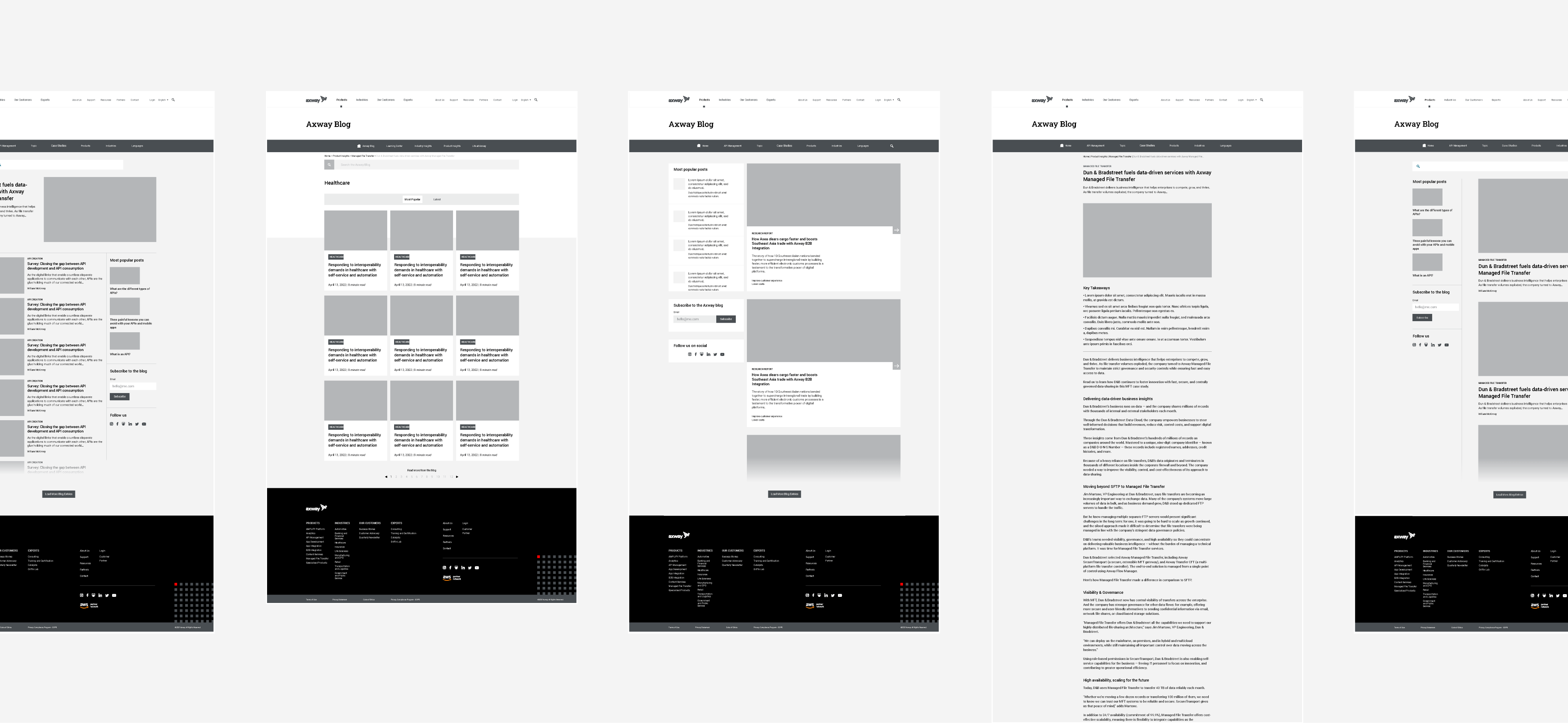
I originally entered the project tasked to redesign the interface. However, there was a clear need to do a thorough UX redesign in addition to this original task. Our principal project manager, Nicky Davis, worked out a timeline to accomplish this UX redesign alongside the original scope of work.
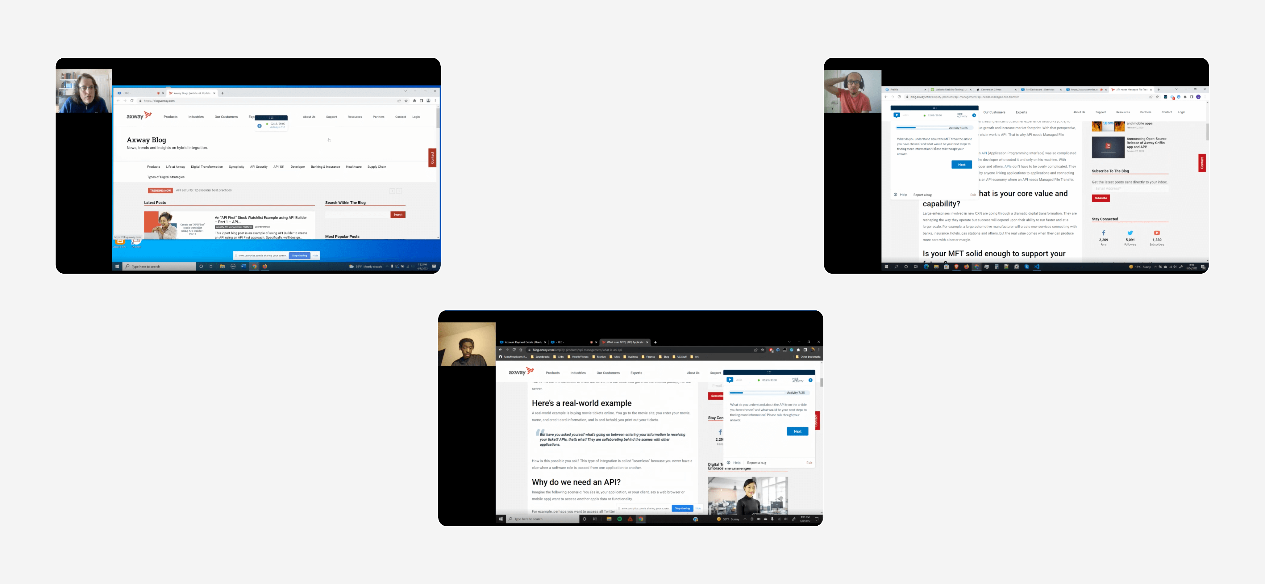
User tests fed the bulk of our UX research with the aid of Userlytics.
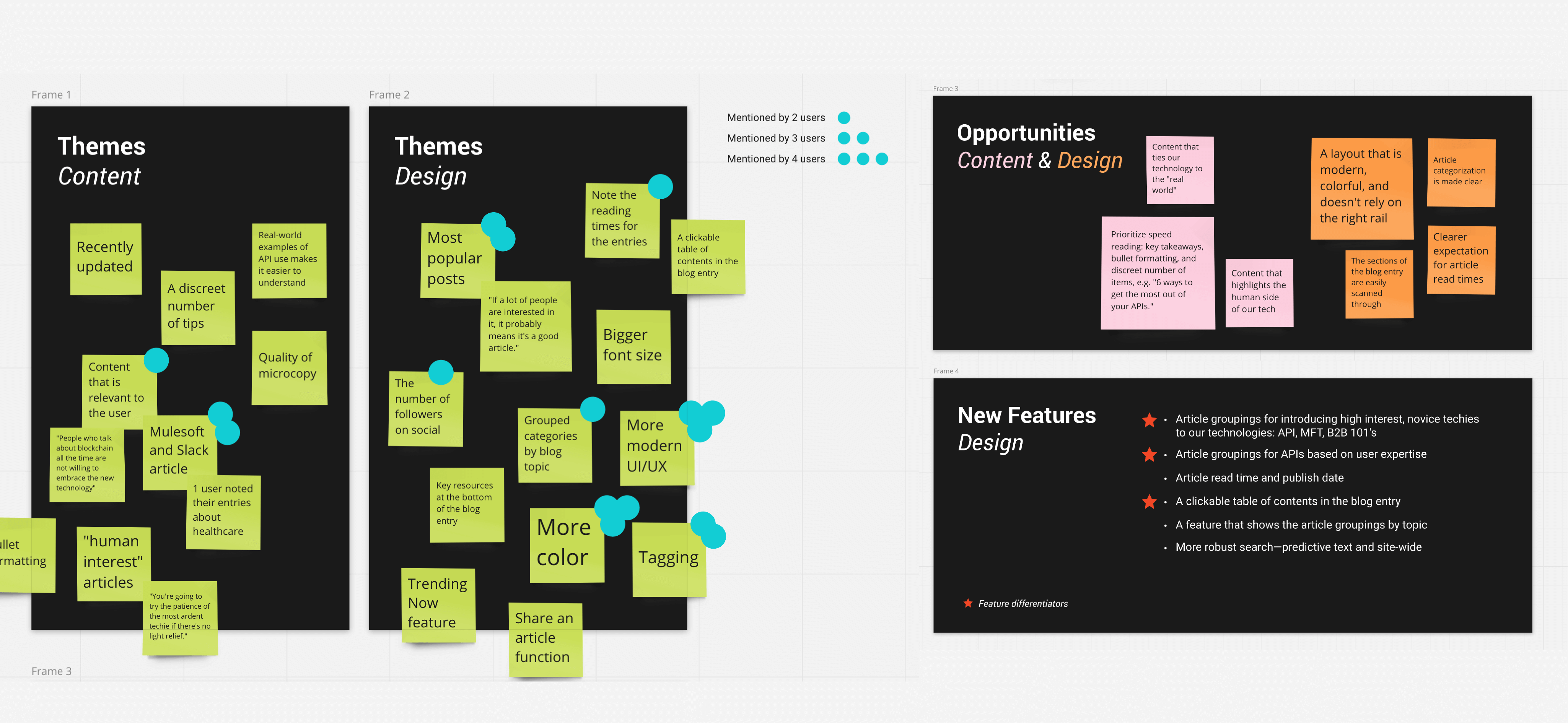
James Maber and I ran 6 remote, unmoderated usability tests to gain rich, qualitative insights on the previous blog design.The findings were illuminating; they led to the proposition of some pretty major changes to the blog design, as well as the introduction of new features.
The UX findings were supplemented with analytics from the current blog design.
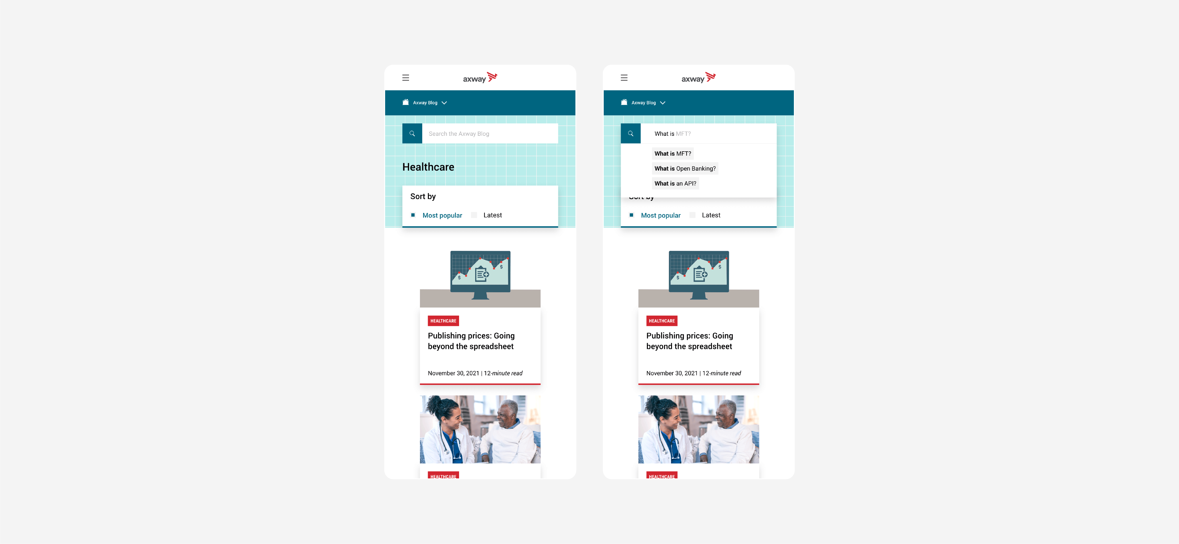
Although we weren’t surprised to see that most users view the blog on desktop, as this corresponds with the viewing modality throughout the Axway site, we knew that responsive design had to be a priority. Google’s Core Web Vitals is a top priority for Axway’s web presence, and the blog redesign had to hit the mark in this area.
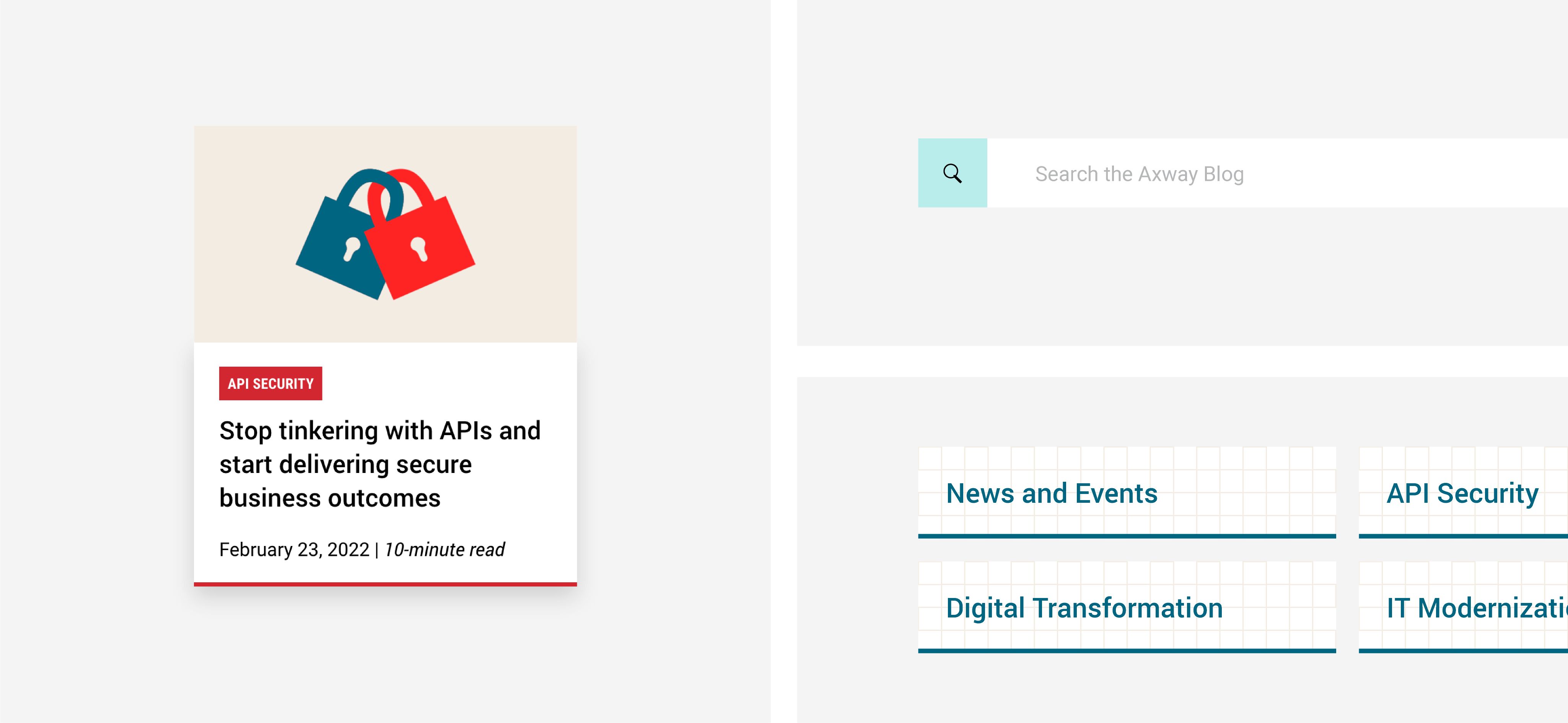
The responsive interface designs were created in Adobe XD and developed in Wordpress by Shawn Borton.
