Modernizing a dashboard interface for a virtual reality company
Client
Hidden
Role
UI design
Collaborators
Undisclosed
I performed a UX/UI audit of a VR company's dashboard interface to find areas in which they might improve.
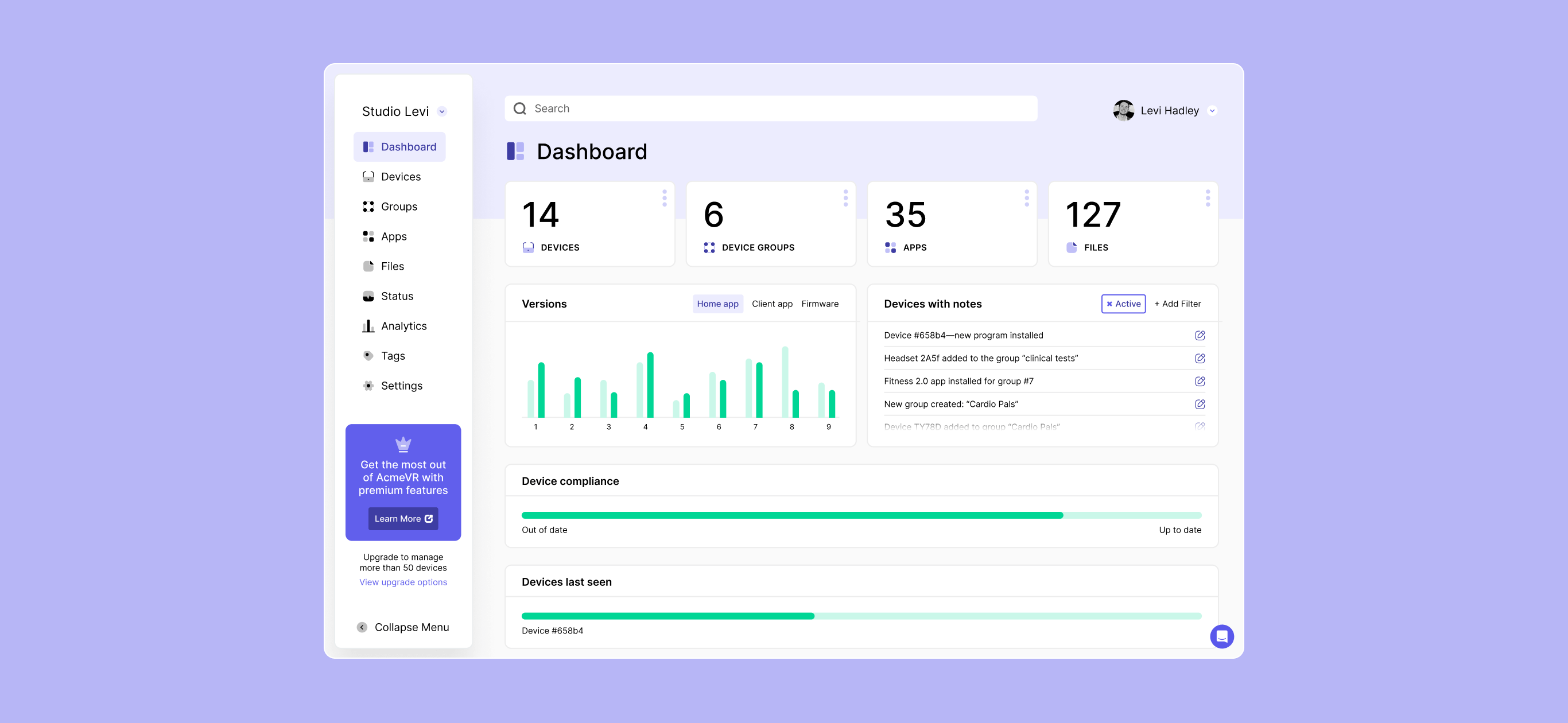
Done pro bono, this was an opportunity to explore a new dashboard environment, and find moments in the UI that might be augmented. Although largely a visual assessment, there were some areas of the user experience that I found might be improved as well.
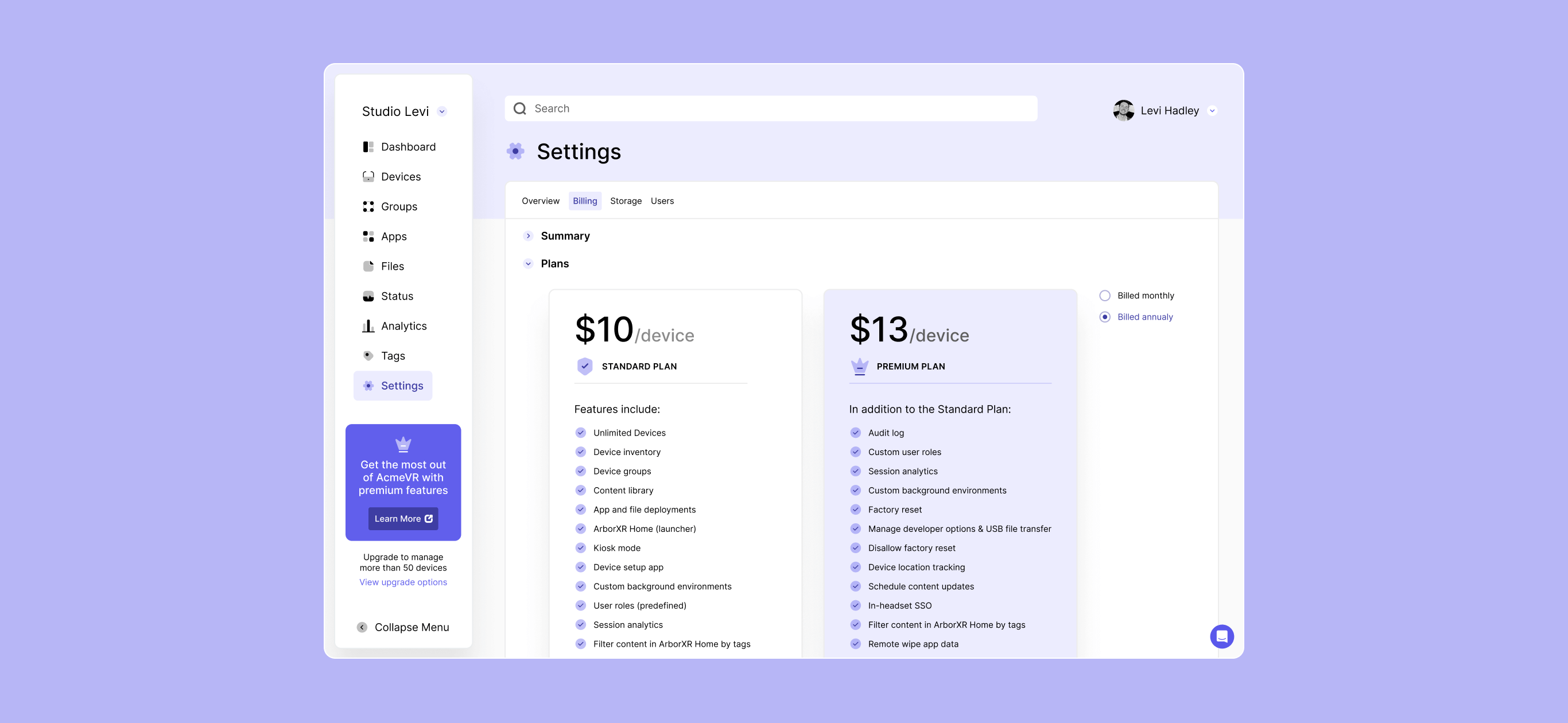
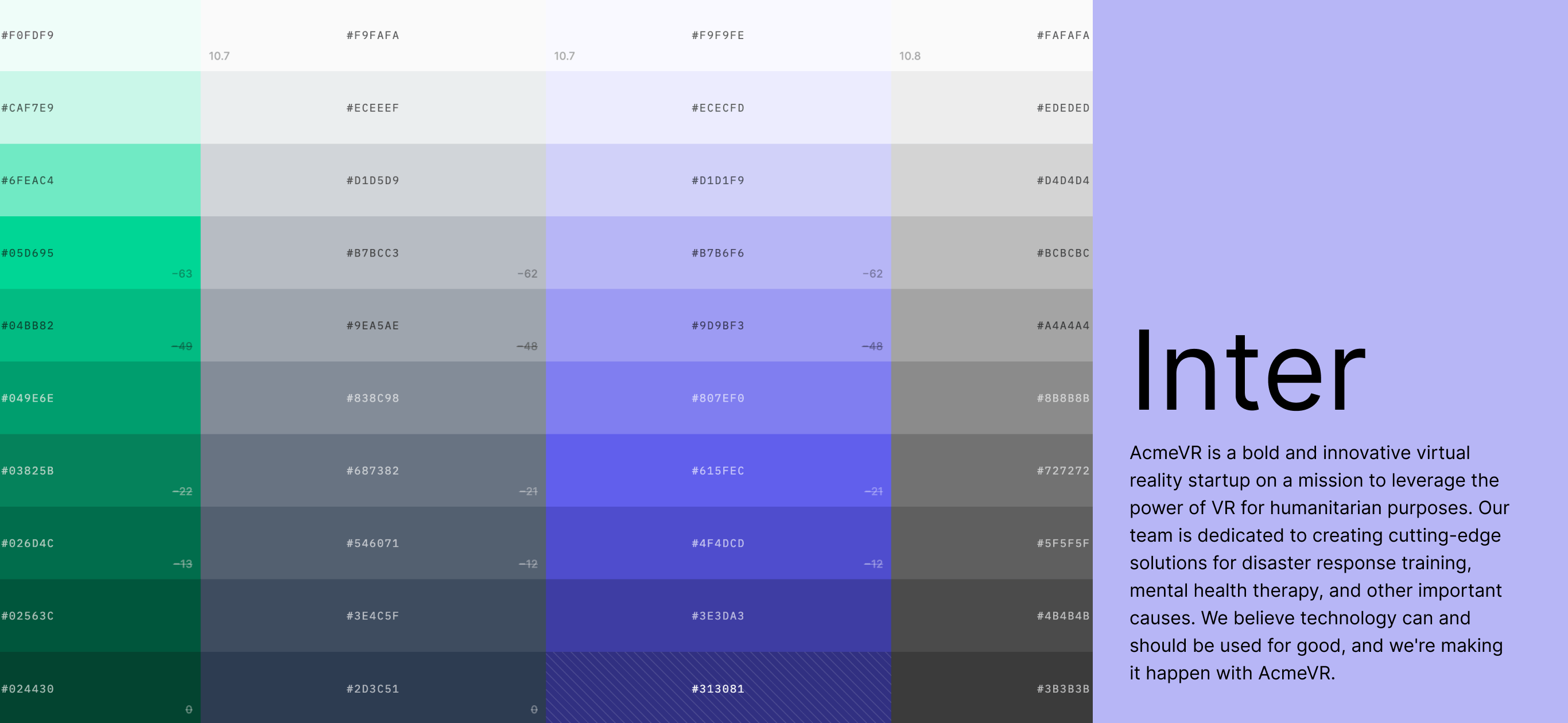
In the proposed redesign, the interface became much more aligned to the brand through its color use, as well as becoming more modern overall. The color palette was equalized for saturation and contrast using a color palette accessibility tool. This helped to create more unity in the interface, on top of increasing accessibility.
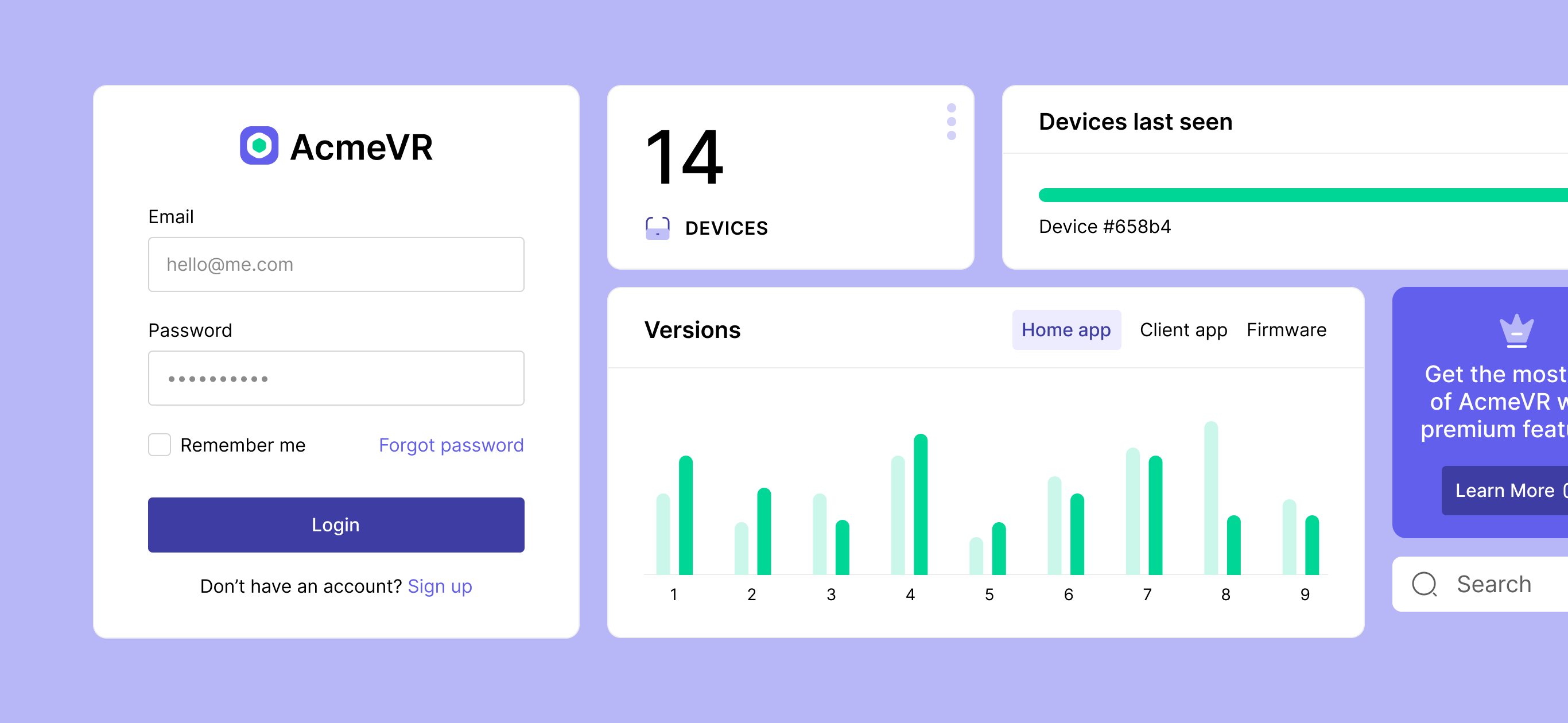
A few areas of the user experience were addressed in the audit as well.
The search function was pulled out of the sidebar, as it was hidden under the organization drop-down. Because the search returns data system-wide, its placement makes more sense in the body of the dashboard, per the principle of common region. Additionally, the page nomenclature was unified in the redesign, as there were a number of discrepancies between the page headings and the terms used in the navigation. This lead to a confusing sense of "place" within the dashboard. Lastly, the CTA in the sidebar was redesigned to bring more attention to itself. Because the product runs on a "fremium" model, it's important to continue to drive users towards converting to a paid plan.
